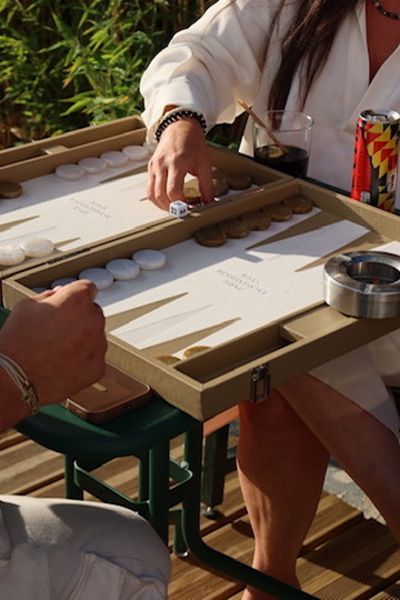
The Backgammon Society is a members-style social club built around stylish backgammon nights, with a home base in Miami and a growing footprint across other cities. When One Media Society sat down to rebuild its homepage in June 2026, the brief wasn't a redesign. It was a rewrite of the marketing logic underneath the design: the existing homepage was a list of content blocks, press logos, a city list, a brand story, a testimonials section, a call to action, arranged with no particular priority. It read fine. It didn't sell.
The short version: turning an information page into a conversion engine means reordering the same content into a persuasion journey, replacing descriptive copy with aspirational copy, and giving every visitor two ways forward instead of one, so nobody who isn't ready to commit tonight simply leaves.
What was wrong with the original homepage?
Nothing was factually incorrect. The problem was structural. A hero image led into a sequence of blocks with no escalating logic, press mentions here, a city list there, brand story somewhere else, testimonials near the bottom. A visitor could read the whole page, admire the aesthetic, and leave without ever being asked to do anything specific. For a brand whose entire business model depends on people showing up to a physical night in a physical city, an admired-but-unconverted visitor is a failure mode.
How do you turn an information page into a conversion engine?
One Media Society's homepage brief reframed the page around three jobs, tagged directly onto every section: convert, build trust, or build brand. The primary conversion goal was driving registrations into a night through one consistent call to action. The secondary goal was capturing everyone not ready to commit yet through a newsletter and city waitlist, so no visitor left without leaving a trace. The always-on job, running underneath both, was simply making the brand feel worth wanting into: premium, social, in-the-know.
Move from descriptive copy to aspirational copy
The clearest single shift was in the language itself. The original copy described the business: "We run backgammon tournaments in several cities." Accurate, and completely uninspired. The rewritten direction sells the feeling instead: "The most stylish nights in the city happen over a backgammon board. Pull up a chair." Neither sentence is more or less true. Only one makes a stranger want to be there.
Replace one audience with a dual path
The original page was only useful to someone in a city with an event happening that night, everyone else was effectively unaddressed. The rewrite builds a dual path into nearly every section: ready now leads to Join a Night, not ready yet leads to Get on the List or Find Your City. An inactive city doesn't dead-end, it becomes a waitlist capture and a signal for where to open next. Nobody who lands on the page has no next step available to them.
Choose language that signals exclusivity, not software
Word choice did real work here. The brief explicitly steered toward "nights, table, club, invitation, city, players, join" and away from "tournament, platform, software, register, sign up, users." The competitive, app-driven side of the product is real, but leading with it on the marketing front door makes a social night sound like a scheduling tool. Invitation language outperforms open-door language for a brand built on exclusivity and FOMO.
What does the actual page structure look like?
Built top to bottom, the rebuilt homepage repeats its core ask roughly every two screens without ever competing two equal-weight buttons against each other. A full-bleed hero makes an aspirational promise and offers Join a Night as the primary action, with Find Your City as the secondary path. A quiet press strip borrows credibility immediately after. An editorial "Experience" section sells the vibe, candlelit tables, music, great company, before asking for anything at all. A city selector turns active cities into live event listings and inactive cities into captured waitlist leads. A tight brand-story section builds emotional connection without trying to tell the whole story in one block. Testimonials with real names and cities prove the room is full of people worth being around. A live Instagram feed shows the brand is actually in motion, not just a polished set of renders. A newsletter capture, wired to Beehiiv, catches everyone not ready to register. And a closing full-width call-to-action band, one bold line, one button, gets the last, unmissable ask in before the footer.
What conversion principles guided every decision?
A handful of rules governed the whole rebuild. One ask per screen, with a visible primary call to action from the moment the page loads and Join a Night repeated three to four times down the page without ever feeling pushy. Dual path, always, so a not-ready visitor has Get on the List or Find Your City rather than nothing. Exclusivity and FOMO, framing nights as limited seats and leaning on invitation language over open-door language. And mobile-first execution, with the primary call to action sitting in the thumb zone and a sticky Join a Night button appearing once the hero scrolls out of view on mobile.
What does this mean for other membership and community brands?
The Backgammon Society's rebuild is a useful template for any brand selling access to something exclusive rather than a straightforward product, wellness studios, private clubs, invite-only events, boutique hospitality brands. The same principles that shaped this homepage show up in how we think about community-building more broadly in our piece on building a cult following for lifestyle brands, and the same instinct to lead with a specific, ownable narrative rather than generic copy runs through our guide to founder story marketing. Whether the format is a homepage, a social feed, or an in-person night, the underlying job is the same: give people a reason to want in, then make it easy to say yes.
Frequently asked questions about conversion-focused homepage strategy
What's the difference between an informational homepage and a conversion-focused one?
An informational homepage presents content in no particular order and hopes a visitor finds what they need. A conversion-focused homepage sequences the same content into a persuasion journey, with a clear primary action repeated throughout and a secondary path for anyone not ready yet.
Should every visitor see the same call to action?
No. A dual-path structure, one action for visitors ready to commit and a lower-commitment option like a newsletter or waitlist for everyone else, converts more of the total audience than a single all-or-nothing ask.
Does exclusivity-focused copy actually convert better than descriptive copy?
For membership, hospitality, and community brands specifically, yes, in our experience. Descriptive copy explains what a brand does. Aspirational, exclusivity-driven copy sells what it feels like to belong, which is what actually drives registrations for this category.
How often should a homepage repeat its primary call to action?
Roughly every two screens is a reliable rule of thumb, frequent enough that no visitor has to scroll far to find the next step, without stacking competing buttons against each other in the same view.
One Media Society is a Miami-based digital marketing and web strategy agency. See more of this kind of brand and conversion work on our case studies page, or learn about our ongoing strategic partnerships through The Advisory.